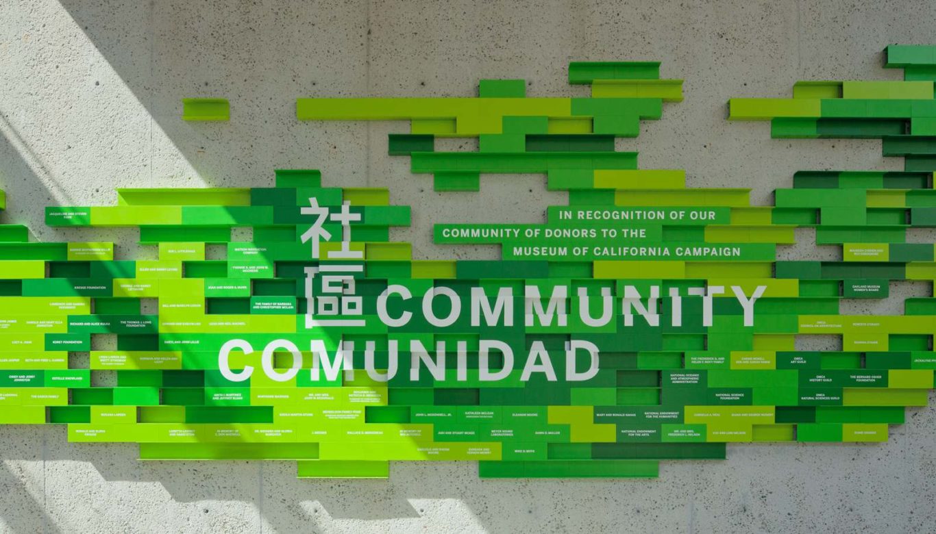
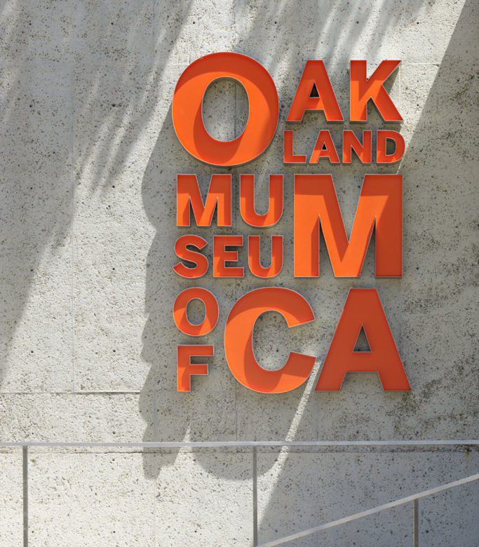
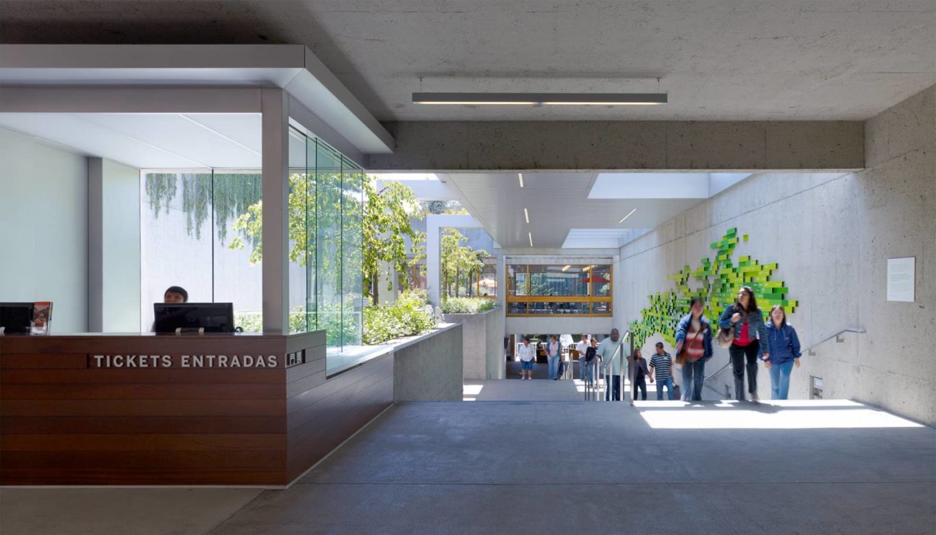
When the Oakland Museum of California began a significant renovation of its landmark 1969 building, it also took the opportunity to update its identity. The SOM Graphic Design Studio created the institution’s environmental graphics program and developed a new graphic identity. The design incorporates details and finishes of the new architecture while remaining sensitive to the historic building. Bold and vibrant colors are used throughout to announce gallery entries, showcase donor recognition, and enliven the overall atmosphere.
The SOM team simplified the museum’s signage by creating a uniform system that forms a “trail” throughout the complex that visitors can easily follow. The museum map was also redesigned to enable visitors to easily understand the building’s unique layout. These axonometric maps, located on every floor, provide an overview and aid in navigation. Primary markers in English, Chinese, and Spanish speak to the diverse local community, further supporting the museum’s mission to embrace the community in an open and democratic manner.
