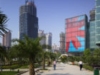
Jianianhua Center

Jianianhua Center
Jianianhua Center
Jiananhua Center

With its memorable facade and careful connections to adjacent public spaces, this building serves as a symbol of revival for the Jiangbei commercial district it supports.

Project Facts
  • Completion Year 2005
  • Size Site Area: 7,733 square meters Building Height: 69 meters Number of Stories: 14 Building Gross Area: 64,340 square meters
  • Collaborators
    Swa Photographer Third Design & Research Institute, Machinery Industry Shenyang Yuanda Aluminium Industry Engineering Co.Ltd Beijing Fortune Lighting System Engineering Co., Ltd. Shenzhen Minsure Science & Technology Co., Ltd. Flack + Kurtz, Inc. Edgett Williams Consulting Group

Anchor for a revitalized district

Chongqing, a port city, sought to breathe new life into its commercial district, Jiangbei. As part of a redevelopment master plan, the city commissioned the design of a central park and plaza that would be anchored by the Jianianhua Center.

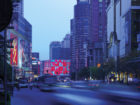
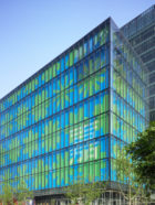
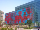
The building is a visible symbol of the revitalization goals: improving the city’s image, stimulating economic development, and streamlining traffic. Its transparent glass facade stands in stark contrast to heavier concrete neighbors, while its precise geometry anchors the adjacent plaza and park.

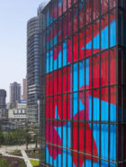
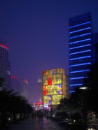
What is most intriguing about the building, however, is its facade, which takes its cue from surrounding large-scale billboards. Through an unconventional application of common billboard technology, the Jianianhua Center’s facade can change in correspondence with the seasons, the time of day, or a special event. The standard triad signage system allows the entire eight-story facade to be transformed into a slow-moving choreographed graphic.


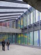
A blossoming facade

The client commissioned SOM to create a supergraphic to celebrate Chinese New Year and the opening of an adjacent park. The concept — an urban flower box — celebrates the approach of spring and captures the ultimate symbol of good fortune in China: 1,000 simultaneously blooming flowers. The concept is visualized through a seemingly infinite combination of abstract pattern and color sequences through the programmed rotation of the individual panels.

SOM’s graphics team worked closely with the architects to make sure the facade would reinforce the overall urban strategy. The images are both a way of visualizing the intense vitality of the city center and a strategy to help the building stand out using non-commercial graphics. As a public artwork, the design adds beauty and color to the neighborhood and serves as a visual anchor for an adjacent park and plaza. It emphasizes the Jianianhua Center’s ambition as a modern civic landmark that integrates architecture and graphic design.

A blossoming facade

Jianianhua Center: A facade becomes art

Jianianhua Center, Chongqing
Jianianhua Center, Chongqing © Tim Griffith

A dynamic landmark

Through the unexpected application of common billboard technology, a kinetic eight-story graphic facade has turned Jianianhua Center, a mixed-use retail and office complex in the heart of Chongqing, into a notable symbol of the Chinese port city’s revitalization.


Jianianhua Center
Jianianhua Center © Tim Griffith

Building a backdrop

With its colorful rotating three-sided billboard — the largest in the world — Jianianhua Center provided a celebratory backdrop for the opening of the city’s new park and public plaza and has since established a unique and enlivening presence in Chongqing’s central business district.


An urban flowerbox

As the building neared completion, the client commissioned SOM to design its first graphic, which was unveiled as a gift to the city at the Chinese New Year festival in 2005. Titled One Hundred Flowers Blooming, the scheme, an urban flowerbox, was visualized through 148 individual panels of eye-popping shades of red, green, and blue.


Jianianhua Center
© Tim Griffith

A symbolic canvas

The design celebrated the coming of spring and captured the ultimate symbol of good fortune in Chinese culture — 1000 simultaneously blooming flowers.


Jianianhua Center
© Tim Griffith

Meditative choreography

Mounted on a system of rotating louvers, the abstract flower images move slowly in choreographed patterns behind the glass wall.


Jianianhua Center
© SOM

Implying an image with space

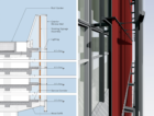
Rather than a solid wall of revolving panels, the louvers are spaced in specific locations to allow views from the café and the escalator landings without compromising the integrity of the supergraphic when viewed from the exterior.


Jianianhua
© SOM

A fractured abstraction

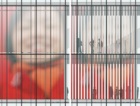
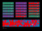
While SOM designed distinct graphics for each side of the triangular panels, the active facade offers a seemingly endless combination of abstract patterns and color sequences through the programmed rotation of 148 individual panels.


Jianianhua
© SOM

Blurring the line between building and media

By having the louver system behind the glass curtain wall, the building and graphic becomes a single unit. This system allows the facade to change continuously and easily, corresponding with the change in seasons, time of day, or in honor of a special event.


© SOM
© SOM

Looking to tradition

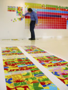
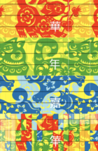
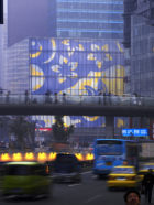
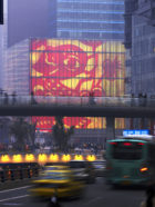
The idea was such a success, SOM was asked the following year to create a new graphic to ring in the Year of the Dog in 2006. This time, the team looked to the traditional Chinese craft of paper cutting for inspiration and once again designed three vibrant schemes that created a kaleidoscopic mix of color.


Jianianhua Center
© Tim Griffith
Jianianhua Center
© Tim Griffith

An urban signal

The graphic team worked closely with the architects to make sure the facade would reinforce the city’s urban strategy. The images are both a way of visualizing the intense vitality of the city center and a strategy to help the building stand out using non-commercial graphics.


Jianianhua Center
© Tim Griffith

Architecture that transforms

In elevating a common billboard to public art, the SOM graphic design team has not only re-imagined a canvas for mixing art, advertising, and cultural expression, but also created an architecture that can transform its character, color, and identity for an entire city.

Jianianhua Center
© Tim Griffith